PEARS
NOVEMBER 2024
A thoughtfully crafted visual and verbal identity that upholds Pears' core values while introducing a fresh, elevated aesthetic.
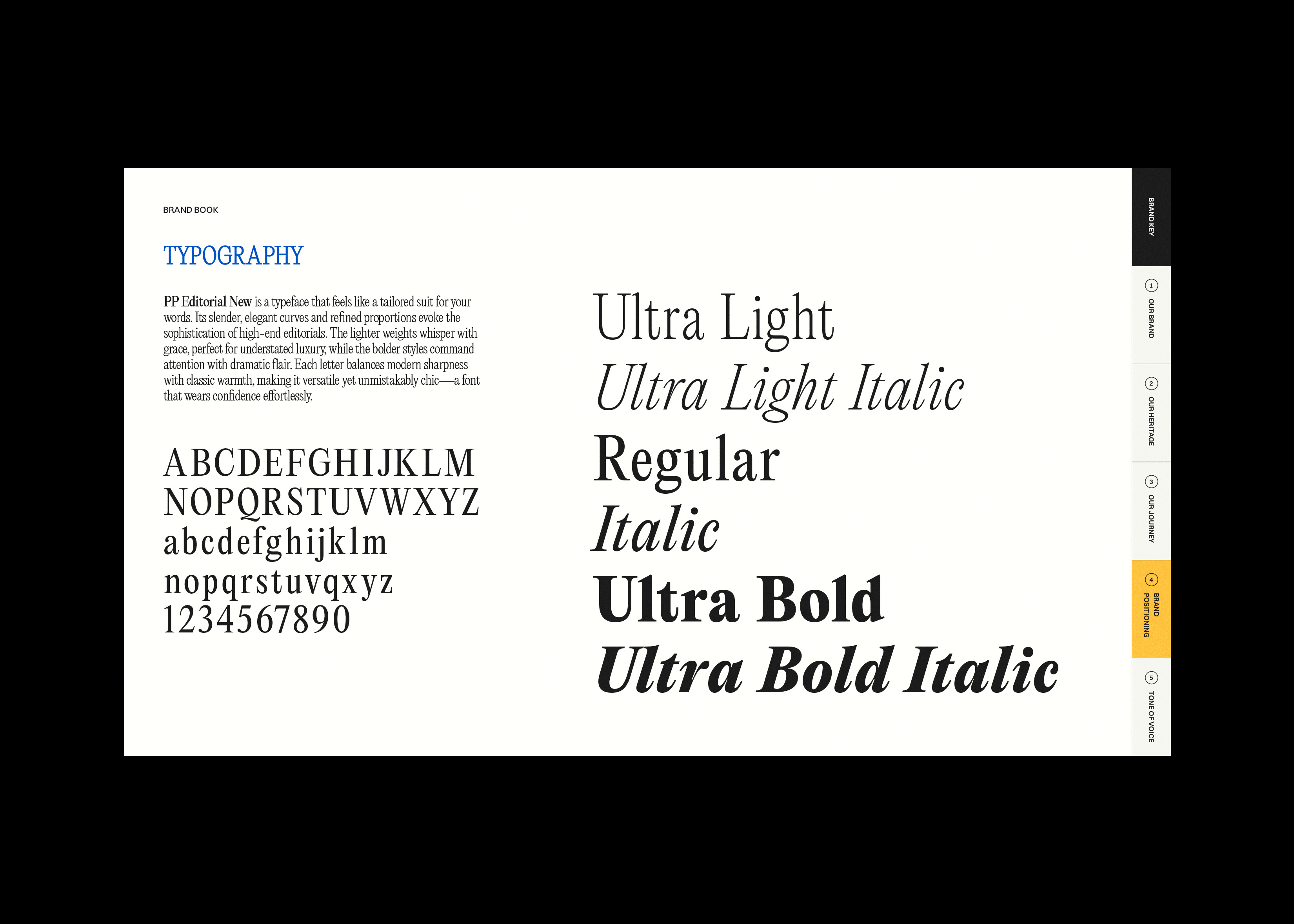
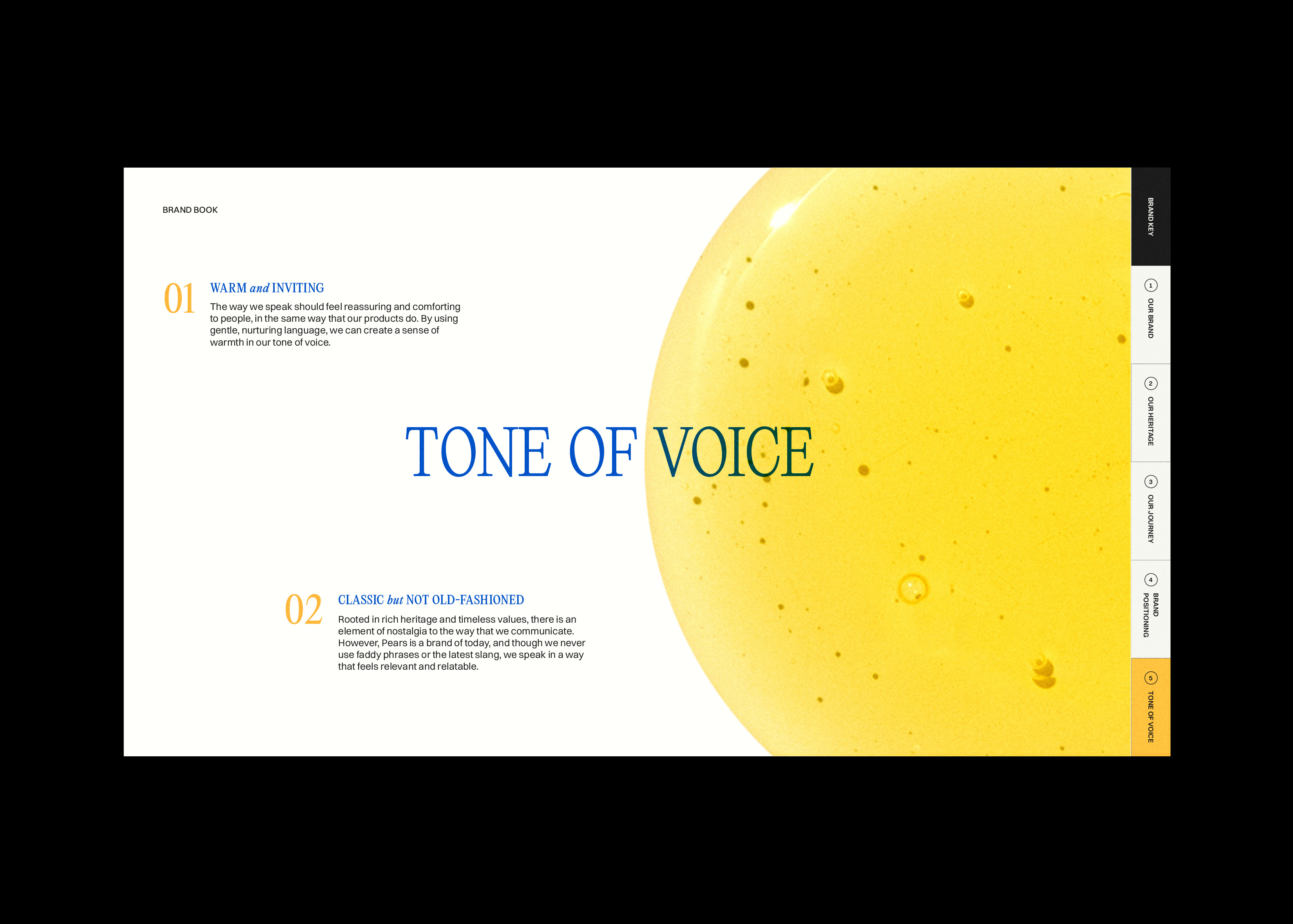
The typography combines PP Editorial New, a refined serif ideal for storytelling, with Switzer, a clean geometric sans-serif that enhances clarity and accessibility. A structured yet airy layout, complemented by generous white space and a subtle grid system, creates a polished and effortless reading experience.
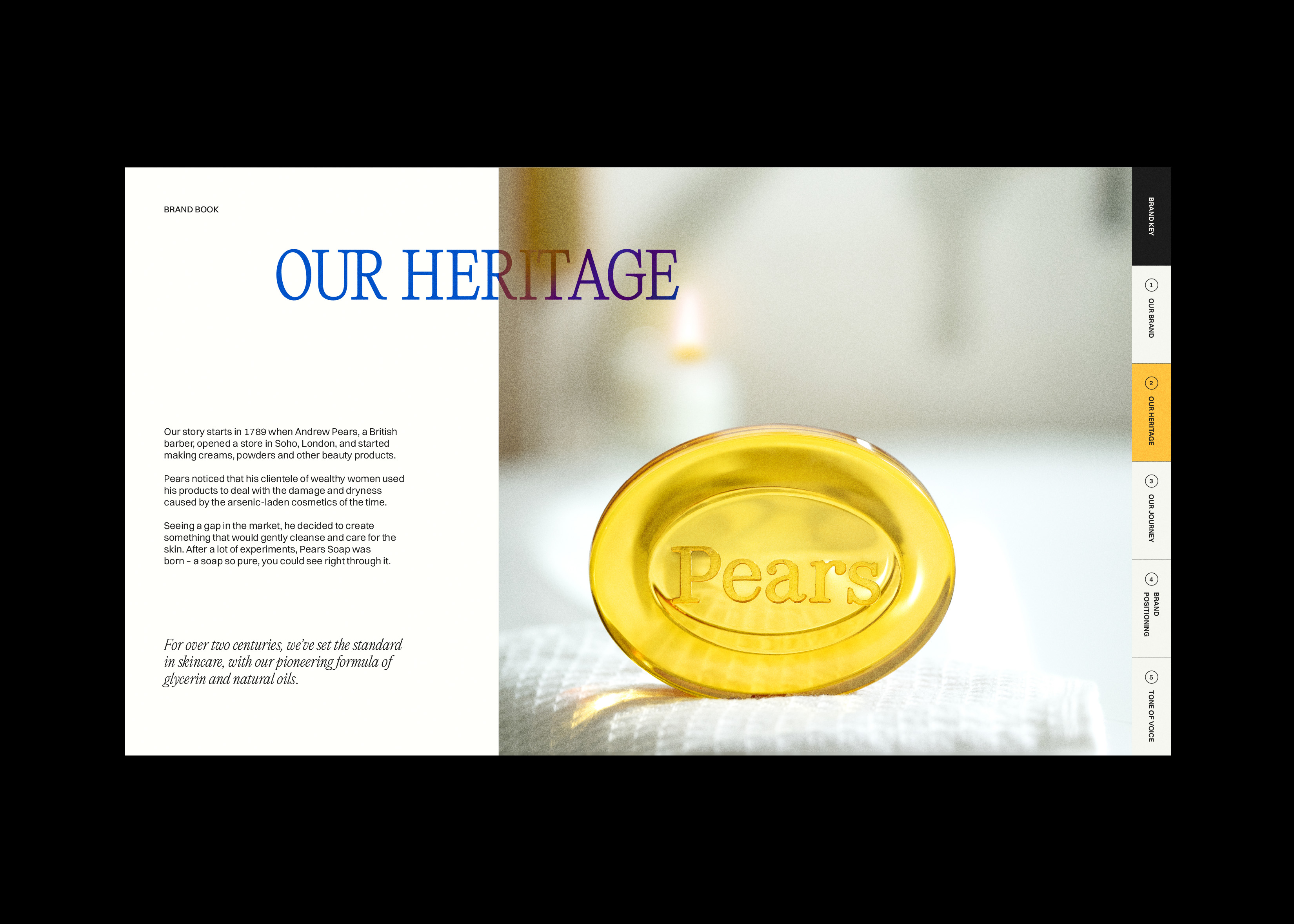
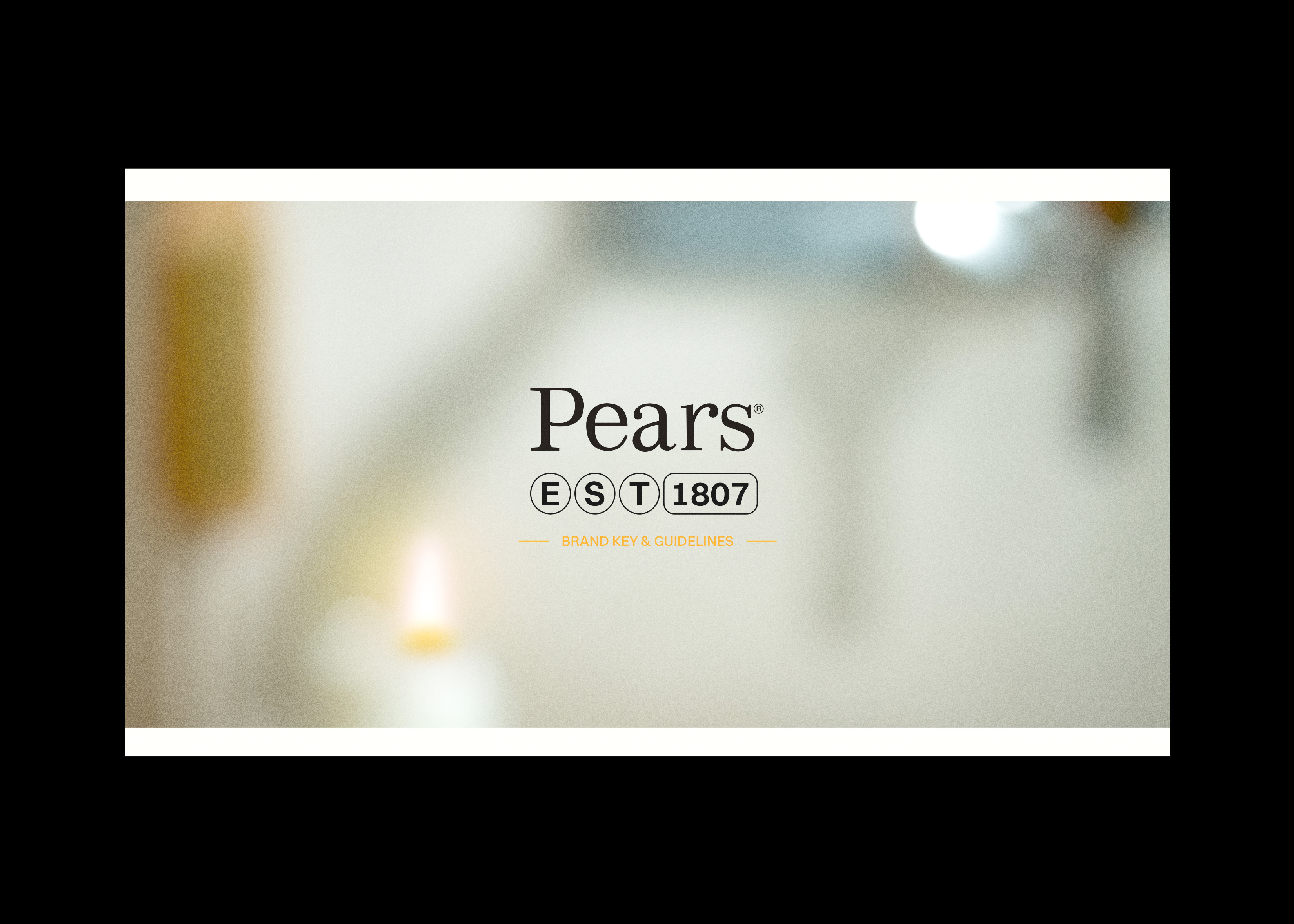
The color palette respects Pears' heritage while embracing a modern perspective. The brand’s signature warm amber-orange, inspired by its iconic translucent soap, remains central, symbolizing purity and nostalgia. To introduce a contemporary contrast, rich royal blue accents add depth and elegance, reinforcing the brand’s premium feel.
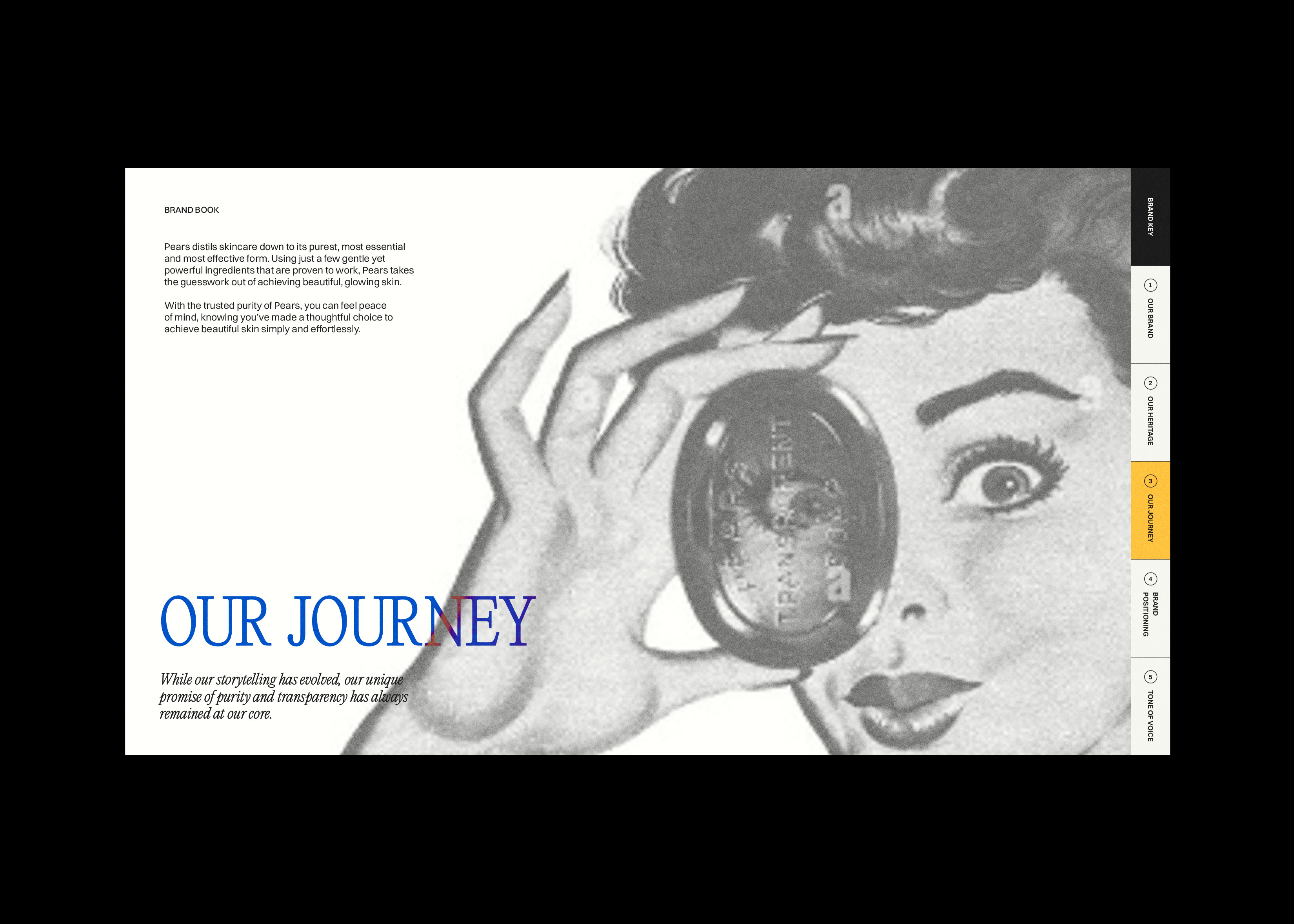
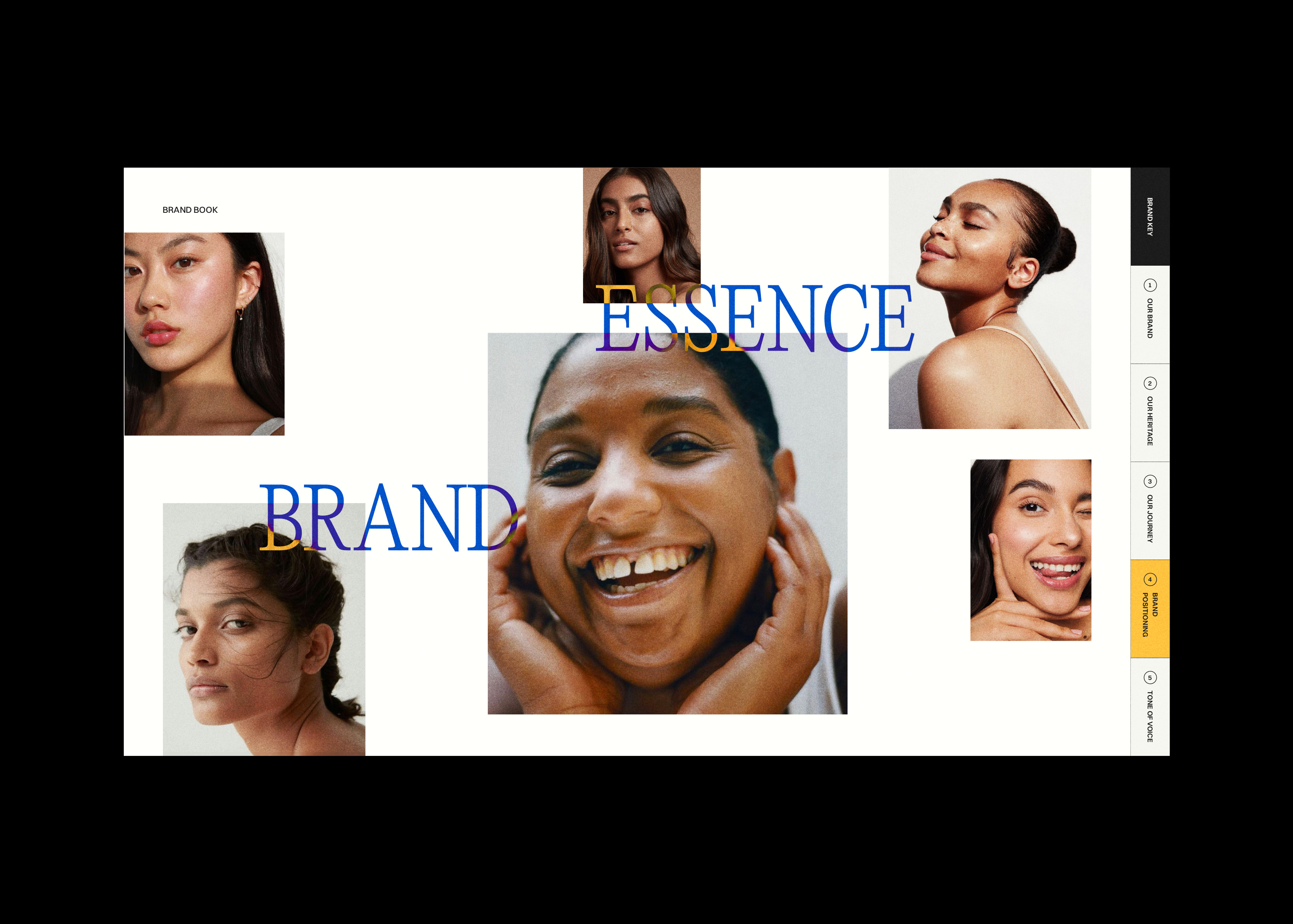
Minimalistic photography emphasizes natural textures and product transparency, cultivating a fresh, authentic visual language. The tone of voice is warm, reassuring, and timeless, reflecting Pears’ legacy while maintaining a relevant and approachable presence. Every design choice works cohesively to establish a seamless identity system that honors the brand’s history while positioning it for a new generation.
field Brand Guidelines, Editorial Design, Brand Book
team Aishwarya Sanchety
A thoughtfully crafted visual and verbal identity that upholds Pears' core values while introducing a fresh, elevated aesthetic.
The typography combines PP Editorial New, a refined serif ideal for storytelling, with Switzer, a clean geometric sans-serif that enhances clarity and accessibility. A structured yet airy layout, complemented by generous white space and a subtle grid system, creates a polished and effortless reading experience.
The color palette respects Pears' heritage while embracing a modern perspective. The brand’s signature warm amber-orange, inspired by its iconic translucent soap, remains central, symbolizing purity and nostalgia. To introduce a contemporary contrast, rich royal blue accents add depth and elegance, reinforcing the brand’s premium feel.
Minimalistic photography emphasizes natural textures and product transparency, cultivating a fresh, authentic visual language. The tone of voice is warm, reassuring, and timeless, reflecting Pears’ legacy while maintaining a relevant and approachable presence. Every design choice works cohesively to establish a seamless identity system that honors the brand’s history while positioning it for a new generation.
field Brand Guidelines, Editorial Design, Brand Book
team Aishwarya Sanchety